How We Test a Browser Game Before It Goes on H5 Game Arena
This month we cut H5 Game Arena down to 32 games. That number didn't come from a target; it is simply how many titles survived a full hands-on review. The library used to be larger, and some of what was in it had never been played past its title screen by anyone on our side. That is the gap we wanted to close. Below is the checklist we actually worked through, game by game, with examples of what it caught. It replaces the shorter overview we published at launch, because this time we wrote everything down.
Every test starts the way a new visitor starts: a fresh tab, nothing cached, no idea what the game is. We note how long it takes to reach anything interactive and what appears first. Some builds go straight to a menu. Others show an engine splash and then sit there, which is usually fine. Many Unity games wait for a first click before they start, because the browser holds back sound until the player interacts with the page. So we wait through the splash, click once inside the frame, and only call a game broken if it still won't move after that. One title in the old library never got past a loading bar that stayed empty for more than twenty seconds on its first level, and it went.
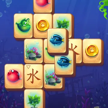
We don't judge a game from its menu. For each one we play at least the first level, usually more, on a desktop with a mouse and keyboard, and we write down what is on the screen: the counters, the button labels, what level 1 contains. In Zoo Tiles that meant noting that level 1 is grapes, strawberries and bananas stacked in layers, and that three matching tiles in the wooden tray vanish together. In Crazy Math it meant timing the first questions, roughly five to eight seconds each, and noticing that the early sums are single-digit addition. Those notes later become the game page, so they have to be right.
Next we load the game in a phone-sized window with touch emulation turned on. Most of the catalogue is portrait, built for a tall phone screen, so on a wide monitor it sits in the middle with bars on each side. That is expected. What we check for is the opposite problem: buttons that land off-screen, text that gets cut, or a game that only works at one fixed size. This is a browser emulating a phone, not a phone in someone's hand, so it tells us a game loads and fits but can't prove how every swipe feels. Each game page says what we checked, and we correct it when players tell us otherwise.
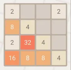
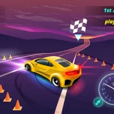
A surprising number of games show one control and respond to another, so our rule is to describe only what we saw working. Dead 2048 moved with the arrow keys, so its page says so. Hill Car Climb accelerated on the right arrow. Extreme Car Driving, on the other hand, didn't respond to the keyboard in our test (the car may simply start in neutral), so its page points you to the on-screen pedals and gear lever instead of promising keys. House Paint ignored the arrow keys entirely and wanted swipes. Where a game needs a deliberate press rather than a very quick tap, as Castle Puzzle's buttons sometimes did, we mention that as well.
Then comes the layout check. A game can run perfectly and still be unusable if its real layout is wider than the box it was packaged for. One drawing game in the old library had a whole column of tools cut off at the right edge of the frame; you could see some of the buttons and none of the rest. We now size each game's player to its own design ratio, but we still look along every edge of the screen for clipped menus before signing a game off.
Most browser games here began life as phone apps, and the conversion doesn't always tidy up after itself. We look for purchase menus, Restore Purchases badges, store-style bundles, buttons pointing to other apps, cross-promotion banners and rating prompts. Small leftovers that don't get in the way, such as the Privacy Policy button on the Hill Car Climb and Pizza Maker menus or a couple of store badges on the Stickman Ninja Warriors menu, we note on the game page so nobody is surprised. Leftovers that take over the screen are another matter. A racing game that greeted us with a welcome-bonus pop-up, a daily-reward calendar, a deals panel, a banner for a different app and two modes marked as coming soon was removed.
Two kinds of prompt mean automatic removal. The first is a forced personal-data box: one dress-up game wouldn't let you do anything until you typed your name into it. The second is the original app's own consent dialog. One game opened with a data-consent pop-up carried over from its mobile version, inside a page that already offers its own cookie choice. Two consent questions in a row, one of which doesn't even belong to the site you are on, is confusing at best, so that game went too.
We also listen and look for things a game might not have the rights to. A rhythm game built on a list of commercial pop and dance tracks was removed for that reason, however well it played. A football game whose selectable characters were caricatures resembling real players was removed for likeness. A minibus game whose title screen was a photo of a real-brand coach, and a stunt game with a supercar that resembled a real model, didn't make it either, and both were thin anyway. We would rather lose a decent game than host one that borrows a real person's face or someone else's music.
Content has to suit a general audience. That ruled out a casino-style game built around betting rooms and a free-gold shop, even though no real money changed hands, and a tattoo-salon game we judged to be an unnecessary risk on first look. It also ruled out games aimed squarely at a very young audience, since the site isn't built for that. Horror had already been taken off the site earlier for the same reason.
Some builds turned out not to be finished games at all. Three were demos: a matching template whose title screen described what you could build with it, a bubble shooter labelled as a kit, and a runner that was the sample scene of a paid engine asset, complete with demo instructions. Another build's page title was still a placeholder test name and its start prompt didn't respond. A flight game's only button did nothing when pressed. These are easy to spot once you actually play, and impossible to spot from a thumbnail.
Only after a game passes all of that do we write its page, and we write it from our own notes rather than from whatever text came with the files. That is how we caught mislabels. The game previously listed as a forest treasure hunt is actually a match-3 with mission targets, so it is now Forest Match in the puzzle category. A title called stack blocks turned out to be a block-unfolding puzzle and became Unfold Blocks. Stickman Ninja Warriors moved from runner to action because it is a physics puzzle about shuriken throws, and House Paint and Stamp It moved into puzzle, where they belong.
When we couldn't confirm something, we leave it out or say so. A few promising games sit on a backup list for exactly that reason: a samurai game where we couldn't tell whether slicing was a tap or a swipe, a cat puzzle where tapping did nothing and the input stayed unclear, and a paint-roller game whose controls we couldn't work out. Rather than guess, we left them off until we can test them properly. On the pages for games we kept, we describe the opening levels in detail and say plainly when we are talking about what later levels usually do.
The result is a smaller site, and we are comfortable with that. Thirty-two games that load, play as described and are explained by someone who has actually played them are more useful than a long list nobody has checked. We will add games back gradually, one at a time, each going through the same checklist before it appears. If you find something on a game page that doesn't match what you see when you play, the contact page is the place to tell us; reports like that are what keep the notes honest.